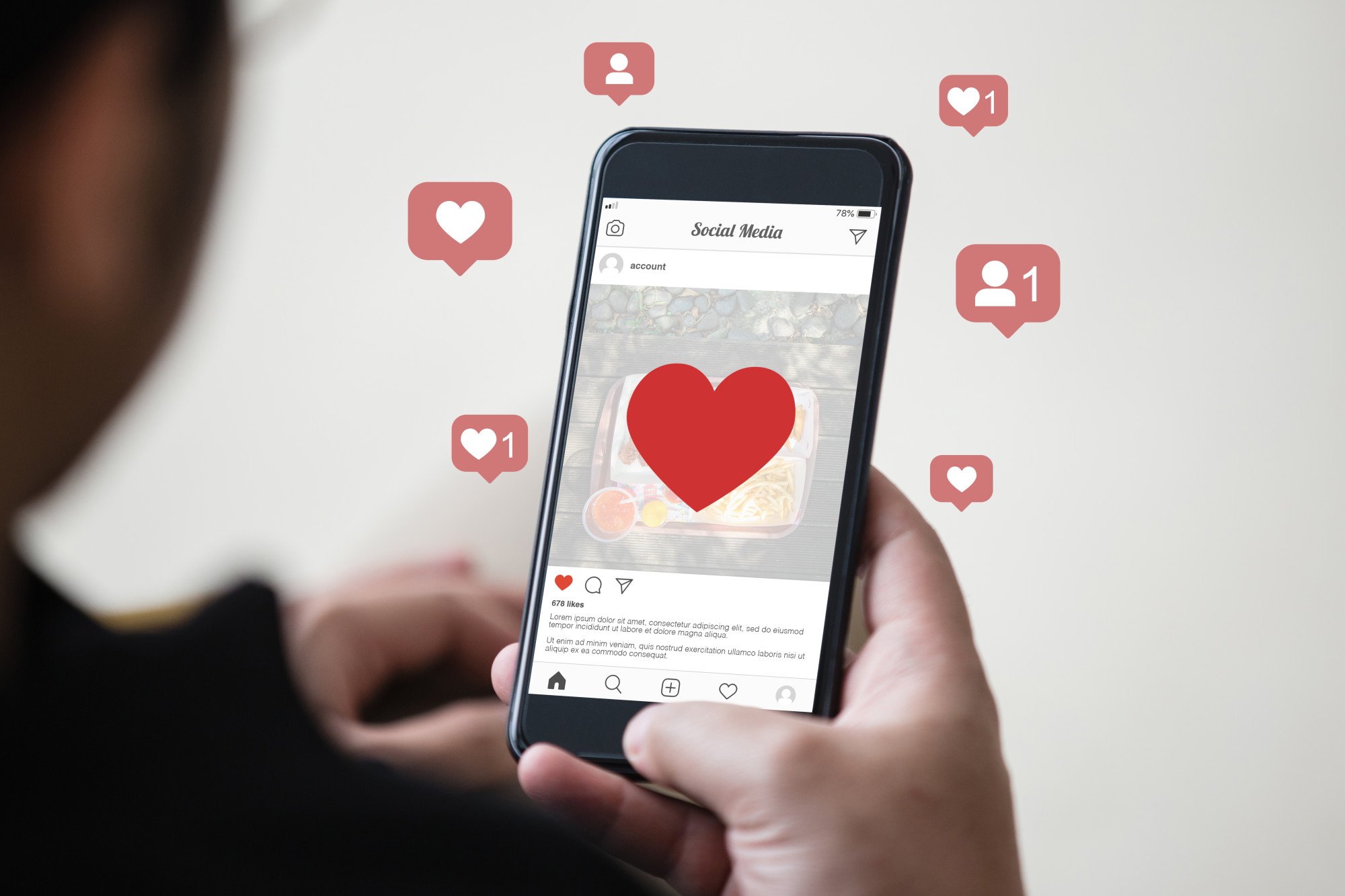
Social media is everything, in case you didn’t already know. What social media means is changing, for example – many brands and consumers are moving away from Facebook.
Even if they’re still on Facebook, there’s one thing all Social Media marketers can agree on – you need quality social media design. Whether it’s a logo, a post about a sale, or even just something funny you share – it needs to make sense for your business.
And no – you don’t have to be a life long graphic designer to make successful posts. You just need to follow the design tips below.
1. The Rule of Thirds
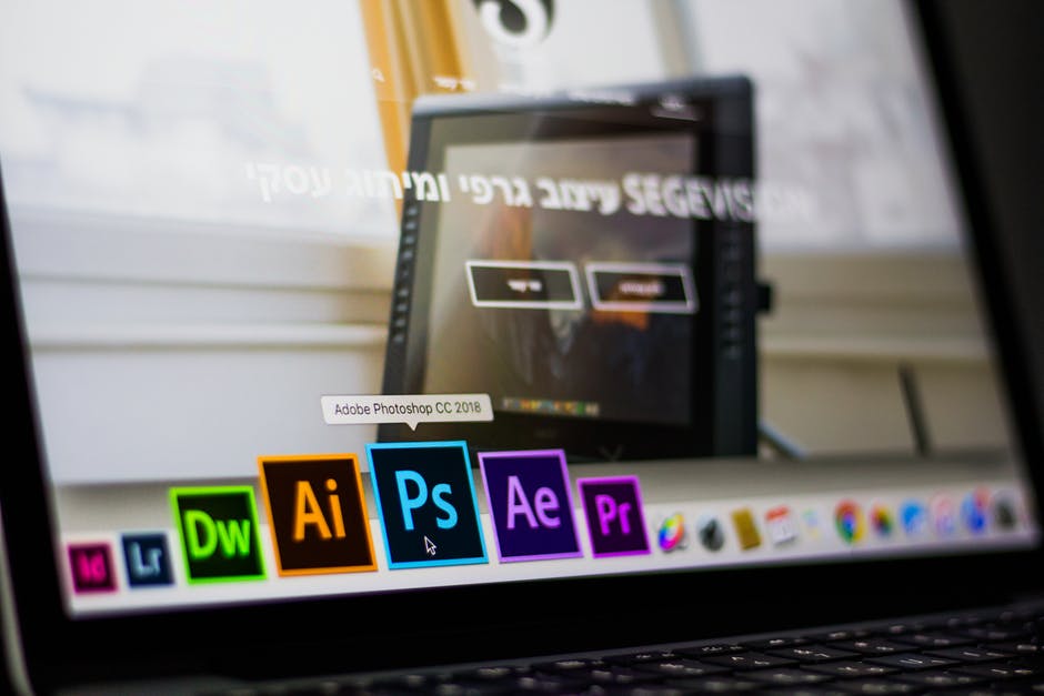
A lot of people can’t afford a full-time graphic designer at first. And that’s okay – that’s what programs like Canva and Adobe Spark are for.
But you will need to understand some design basics before you go posting things on social media.
One of the most basic design rules is the rule of thirds. It’s relevant in all sorts of art – from photography to graphic design. The idea behind it is that every image has three sections.
You want to have most of the activity in one out of the three sections. That means shooting your subject in just one of the three inner-section frames.
Or only having text in one frame – you get what we’re saying. A lot of beginner designers overload on design and text. Negative space, or empty space, is an essential part of good designs.
Your goal isn’t to distract the eye and overwhelm the viewer. You want them to look directly at the one third you’ve spent time designing.
2. Don’t Overload the Text
There’s a rule on Facebook when you upload images for ads. These images can’t be more than 20% text. That’s Facebook’s way of keeping you within their guidelines for ads (and getting you to spend more money by running more ads).
While this is sometimes annoying, it’s a good guideline. If you’re not putting this image in a Facebook ad campaign, you can easily get away with 30% text. But we don’t recommend going over that.
Remember, the idea is to draw the eye to the image – not to have someone glance over it because it looks like too much to read.
When it comes to graphic design, assume the person looking at it is the laziest person in the world. Make it as easy as it can be to get your information across to them.
3. Keep Characters Simple
If you’ve ever worked with Google Adwords then you know they’re really picky about what you use as your ad text. You should be just as picky when you create images with text.
That means nothing in all caps, no crazy fonts, nOthInG liKe this! While a few well-placed emojis are fine, is that really part of your branding?
Emojis appeal to a younger crowd and they come off as very casual – so make sure that you feel comfortable portraying that message to your customers.
As a good rule of thumb, ask yourself if Google Adwords would allow the text format, and if not, simplify it more.
4. Have Versions of Your Logo
You spent money on a logo (or you’re going to). It may have your whole brand name laid out in a font you spent days choosing. But what if there isn’t room on a post to put your whole logo?
You need something short that still denotes that this content is part of your brand. Think about Buzzfeed. They have a logo with their whole name, right? But they also have a range of little icons they’ve branded that work as mini-logos as well.
You can see these mini-logos as their pages profile photos if you follow them on social media.
So – you know you need different sizes of logos – but what about colorways and themes? It’s cute to put a little winter hat on your logo for the winter months, so ask your graphic logo designer to give you some options.
It doesn’t have to be anything crazy. Maybe you change your logo colors for a weekend of a big football game to show your support.
You don’t have to do what IHOP did, which is still confusing us. If you didn’t know, they changed their online name to IHOB (burgers) to announce their new burger line.
It confused fans everywhere and they eventually reversed it, saying it was just a marketing ploy. We still don’t know if that was their plan all along or if they saw it was failing and decided to jump the IHOB ship.
5. Brand Everything
If you’re not using YouTube marketing, you’re like a year behind schedule. Your videos don’t have to be perfect, nor do your on-screen staff have to be trained, paid, beautiful actors.
You just need to get video out there! But not before you adorn your video with graphic design for YouTube. You need a profile picture, a banner on your channel page, and a branded intro/outro.
6. Don’t Be Afraid to Re-purpose
If you see someone you follow – even another business posting something you like, you may absolutely repurpose it. Obviously, you’re not going to copy their post and paste in your branding – but you can create a similar post.
Before you decide to play copycat (hey, we can only create so much content) look at how that post is performing for them. If it’s doing well – by all means, try it out yourself.
Social Media Design
If you take anything away from this article – let it be this: No matter what content you create – make sure it’s consistent. You need to keep the same general brand colors, the same voice, and the same consistency of posts.
If you only post once in a blue moon, it doesn’t matter how good your social media design is – your brand is going to be out of sight, out of mind.
Want to learn how to network better on social media? Click here.